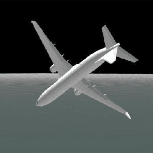
Today the JTB released a report that the 2011 ANA incident was far more dangerous than originally thought.
The Wall Street Journal wrote:
After the co-pilot mistakenly operated a rudder-control switch at 41,000 feet, instead of a different switch that unlatched the cockpit door, the jetliner plummeted 1.2 miles in slightly more than 30 seconds and briefly flew nearly upside down. One attendant told investigators that after she felt “earthquake-like vertical shaking,” she slumped to the floor on her knees from downward forces so strong she couldn’t raise her arm.
John Doe Tweet

The Japan Transport Board report included these chilling notes:
The plane was subjected to forces nearly 2.7 times the force of gravity. The jet exceeded its structural-load limit, or the most stress the aircraft is expected to experience in service
John Doe Tweet
In other words, the plane came close to disintegrating in space.
Why this matters?
In 2001, all 260 people on American Airlines Flight 587 died when overuse of the rudder created extremely high aerodynamic loads that caused the vertical stabilizer to separate. The plane fell from the sky.
What's the User Experience connection?
From the report:
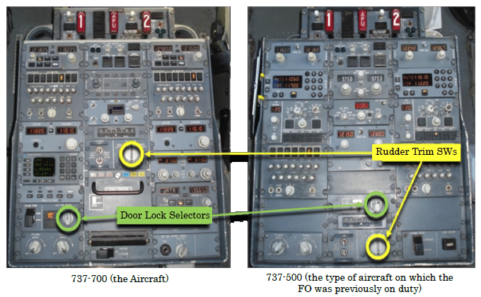
It is somewhat likely that the similarities between the switches for the door lock control and the rudder trim control in their operability contributed to the delay in his recognition of the erroneous operation.
John Doe Tweet
Poorly engineered usability.
The co-pilot in trying to unlock the cockpit door, instead turned the Rudder trim switch. This might at first blush sound like pilot error, but in reality it wasn’t.
The co-pilot had flown both the older AND the newer version of the Boeing 737. In the new version of the Boeing 737, the location of the switches changed.

In the new aircraft, the Door lock selector is now below the Rudder Trim switch, but is farther apart.
However they are operated the same way, and ‘feel the same when operating’.
- Both switches have a brim at the bottom.
- They both require to be depressed
- Both switches are similar size and must be rotated by firmly holding them with three fingers
So even though the switches were still in different locations, their proximity to each other AND the similarity of operation led the co-pilot to feel like he was unlocking the door when in fact he was about to send the plane in an almost uncontrollable roll.
Consistency is key to a good UX
Cameras and phones are classic examples of using the same control across different iterations. When they don’t, they create inconvenience, but nothing worse than that.
On a plane, train or other mass-transit vehicle, they can have real life or death consequences.
Hopefully Boeing will take this to heart and use consistency across planes their pilots usually fly – the 737 itself has 6 variants – to keep you and I safe.


Comments
Comment policy: We love comments and appreciate the time that readers spend to share ideas and give feedback. However, all comments are manually moderated and those deemed to be spam or solely promotional will be deleted.