Comparing three financial app designs - Check My Rate (Auto) to see who makes it seem effortless and who doesn’t

    Build a high-conversion marketing page by creating an effective persuasion ladder for your target consumers

    Persuasive Design in Financial Services

    Overview

    Users prefer Check My Rate applications because they promise ‘a personalized rate fast’ without dinging their credit. And it gives users an opportunity to test-drive the bank, credit union or fintech.

    In this conversion design examples, I picked two fintechs and a bank to see creates the most persuasive experience – i.e. who does the best job of getting their user throught their financial application as efficiently – and painlessly – as possible.

    Evaluation Criteria: Financial application design
    1. Getting Started – Is the starting screen clear and simple?
    2. Input Speed – How fast does it ‘feel’ to complete (
    3. Error handling – How easy is to find and fix errors
    4. Abandonment – Are their tooltips, live support available
    5. Interaction Design – Are native features and appropriate form elements used?
    1. Getting Started
    Starting any financial application – no matter how simple – is anxiety inducing. Seeing the first screen that’s full of text, requirements and form fields takes that anxiety dial to 11. So which of these 3 financial apps ease the user’s fears and makes it easy to get started – and which ones don’t?
    Financial application design - UI input speed
    First impression - financial application design

    CapitalOne asks just one question but surrounds it with overly verbose copy. Autopay sets the right tone by using two simple questions, just the right level of copy and contact info.
    See slides 4-7.

    2. Input Speed
    From extensive user research, I’ve learned that people prefer short screens, even if it more overall screens – it helps them feel they are making progress. But it’s not just the number of form fields – it’s how they are presented that matters.
    Input speed - financial app design
    Address lookups in mobile is a prime way to speed up inputs – esp. when apps don’t use mobile numeric keypads for zipcodes. See slides 13 -17
    3. Error handling
    How apps handle errors not only lower speed but also increase abandonment. In mobile, it’s easy to forget that the keyboard takes up half the screen. And people scroll quickly.
    Financial app design - error handling
    Prime example – I had scrolled past the error and clicking the Next button did not do anything. I thought the app had stopped working – when on a whim I scrolled up to see the error. Autopay has an even more egregious error on slide 18 – an optional field treated non-intuitively. Test your app on a real phone – while making deliberate errors to identify issues.
    4. Abandonment
    Not knowing ‘the right thing’ to fill in is the biggest reason for abandonment after errors. An example in auto loans is not knowing the exact trim of your car – and not getting help in figuring out how to answer that question.
    Abandonment - financial design best practices
    Here Capital one – I could chat quickly with someone CapitalOne. The right placement of Chat or a Phone number can improve conversion numbers and related KPIs.
    5. Interaction Design
    How apps handle numeric entry and dropdowns on mobile can make the difference in one app seem easier than another.
    Mobile design example - financial applications
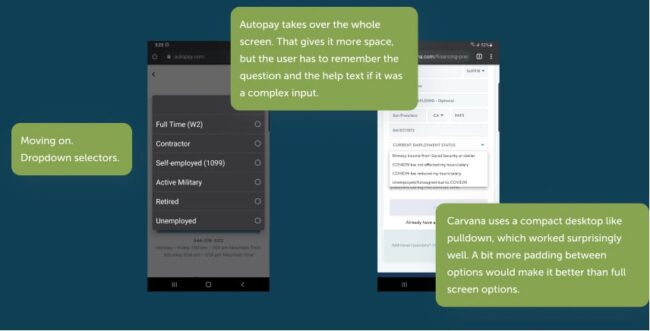
    Carvana uses a simple pulldown which keeps the question up – but invites fat-finger selection of the wrong item. Autopay takes over the whole screen, but you lose the question and any associated help info. Check out the next slide as well for selecting inputs that are fast, but potentially not ADA compliant.
    FREE GUIDE

    Create an insanely persuasive user experience in 5 steps

    From vanilla to high-conversion – this guide will you get there without the mistakes your competitors make.

    Meet your guide

    A practicing UX pro from San Francisco

    I wrote this guide to help you crush it. I’ve spent 20+ years in the trenches, helping people like you separate trends from fads, one-off hacks from repeatable strategies with a single goal. Grow your product or service. Consistently. Isn’t it time you unlocked growth and moved to the next level of success? Using a simple approach that has delivered results from Startups to the Fortune 5. Let me show you how to transform your vanilla user experience to an insanely persuasive one so you can finally crush it.