Persuasion vs. Usability

Using the right design approach to crush your competition

Usability has been the default approach for designing UX for websites, webapps and apps.

Ten years ago, it used to be a product differentiator because most experiences were not easy to use.

Today, most of your peers and competitors are still offering the same one-size-fits-all UX, which makes it difficult for your business to stand out from the crowd.

Your growth will stagnate, and you’ll feel like you’re just spinning your wheels.

Try this Simple Experiment…

Put yourself in your customer’s shoes for a moment…

Open your competitors’ pages and swap their logos around.

You’ll find that the experiences are generic and interchangeable.

Now, you can see the difference between vanilla usability and more powerful customized persuasion-focused experiences.

And this is exactly the “secret” to rising above the noise and crushing your competition.

Let me show you the smartest UX approach for attracting, converting and retaining today's fickle consumers.

Persuasion vs Usability Showdown

Persuasive UX

Vanilla Usability

Uses usabilty as a base layer

Uses usabilty as a base layer

Leverages desktop AND mobile strengths equally for best results

Designed primarily for one platform and adapted for others

Embeds persuasion ladders designed for your unique customer segments

Generic, one-size-fits-all design to make it look simple

Delivers a clear, emotional value proposition for an instant connection

Vanilla or missing value proposition fails to engage

Handholds users across the experience increasing engagement and conversion

Visitors have to figure everything out, creating anxiety and abandonment

Deep understanding of user needs helps deliver the right information at the right time

Shallow user understanding creates over- or under-explanation, frustrating users

Stands out in a crowded marketplace

Instantly forgettable - blends in with its competitors

Why persuasion is your key for high performing user experiences.

Every page and section of your website or appneeds to be designed with one hyper-focused purpose – to effortlessly persuade your target customers into taking an action.

By creating the right persuasion ladder throughout the buying journey that speaks to their unique needs, you’ll more easily turn visitors into loyal customers.
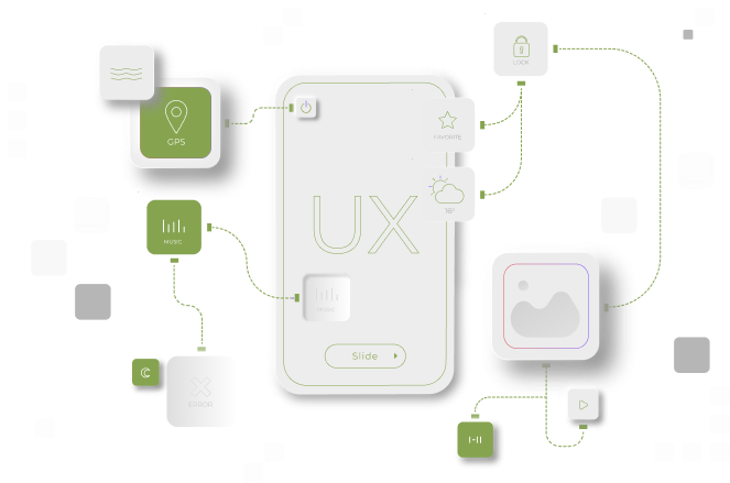

Design for persuasion across the entire customer journey

Prospect

Effectively engage and convert to trial/ initial offer

Customer

Upgrade or add higher value products that solve their unique problems

Evangelist

Attract throngs of new and returning customers, and create brand loyalty

The most successful brands are always persuading - both their prospects and loyal customers:

Yes, the proof really is in the pudding!

I have used this breakthrough persuasion approach for clients big and small – across different verticals and customer segments with KPI busting results

Want to skyrocket your growth?

Hi there,

I’m Subir Kumedan. A practicing User Experience professional based in San Francisco – since 2000.

For me, creating an experience that grows products and companies is my passion, not a career.

And seeing individuals and teams grow as they learn to create the right experience themselves – that’s my biggest motivator.

Let’s find out if we’re a good fit. You’ll walk away with solid insights even if we’re not. Promise.

FREE DOWNLOAD

The Facebook Ad Template Library

Copy & Paste These 7 Proven Facebook Ad Campaigns to create low-cost, high conversting ads on-demand

From Usability to Persuasive UX in 5 steps